
17 Bedroom Paint Two Colors Scheme.
The surroundings in which we live affect our personality and mood a lot, which makes it necessary to make our surroundings look happy in order to be happy. It starts from a place we call home; it should not only affect a person’s mood but also reflect it, especially in the bedroom, because in the whole house, a bedroom is what is closest to a person.
A bedroom has more to give beside a place to crash after a tiring day. It should be relaxing and refreshing to lighten up your mood on weekends and holidays, which is why it is necessary to choose the right colors and interiors to surround yourself.
Choosing colors can be overwhelming as there are so many options to go for, but instead of getting confused, get inspired with our suggestions.
There are many styles of wall paintings – geometric patterns, dual-tone walls, mandala art walls, and whatnot. All of these give a pretty look to the room, but only one type of painting style can be finalized.
You have a blank canvas for now, let’s get to the idea and paint the wall like a canvas.
Color psychology is a real thing that affects us a lot without us knowing about it. Some colors are happy, and some are sad, which evokes anger, it depends on the person. For some people, colors play a major role, while others don’t care.
Welcome summers with warm colors
Colors like red, yellow, orange, etc., are warm colors. Surrounding yourself with warm colors would evoke feelings like- positivity, energy, pleasure, and satisfaction.
Always pair two or three colors while painting a bedroom, or else you’ll end up with a mono-colored bedroom which eventually would start looking boring and dull.
Try pairing warm tones with the cooler tones to create a balance of emotions and colors.
Sometimes it can be tough to choose a cooler tone to pair up with a warmer tone, in that case, neutral tones come to your rescue. Neutral tones are highly blendable and elevate the beauty of the primary color despite being an accent color. Though experimenting with warmer and cooler tones is a must to try.
Cool colors are cold

Colors such as blue, green, and purple are cool tones. These cooler tones help you stay calm and make you feel peaceful. Even Though these colors are calming, if they overpower your emotions, you’ll feel sad, depressed, arrogant, etc., as nothing is good beyond a certain limit, that is why these colors should be paired with cool or neutral colors to balance your mood.
Get into Neutrals
Colors like- black, white, beige, brown, gray, creme, etc. are neutral colors. They can go with any color easily if you have a neutral-colored wall. Pick any color and paint your walls into it, as the neutral shades blend in with any shade of colors and provide a majestic appearance.
Neutrals go well with cool and warm tones. Neutral tones make you feel calm and give your bedroom an elegant appearance.
Yellow with gray
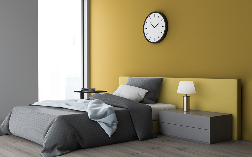
It is a combination of warm and neutral colors, which looks really cool. Gray color enhances the beauty of yellow paint and gives you a bright and cheerful room.
Besides the wall paint, it would be a good option to use furniture and props similar to the wall paint to create color harmony.
Blue and white, a timeless combo
Blue paired up with a neutral color is the most famous combo. The reason is pretty clear- they make your room look elegant when paired together.
The blue color brings you peace and calmness, while the white makes the room look brighter and refrain the blue color from overpowering the whole vibe.
Shades of pink
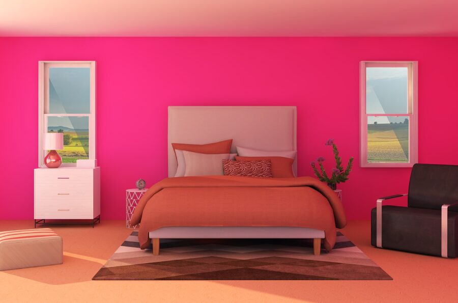
The combination of pink colors’ two different shades creates a happy and relaxed mood vibe. The lighter shade of pink resembles white somewhat and reflects white colors’ properties, such as making the room brighter and creating the illusion of a bigger space. This type of color combination works great for kids and young adults.
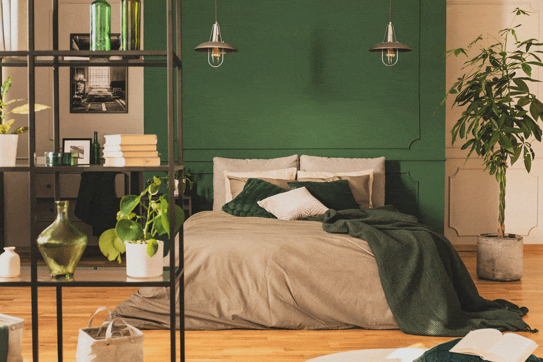
Green and purple are too cool?

There is no limitation in color combinations; cool colors can be paired with warm, neutral, and cool colors. It’s all a matter of preference.
Purple with this dull light green looks blissed-out and unique, and a bit of neutral touch makes it seem balanced and beautiful.
Also read what are the most important dark green paint colors?
Only neutrals
Using only neutral shades isn’t a bad idea if there is variation in the shades. A mono-colored neutral room would be boring, but these two colors blend in with such elegance to increase the aesthetic appearance of the room. There are other accent colors to create a happier and calming vibe.
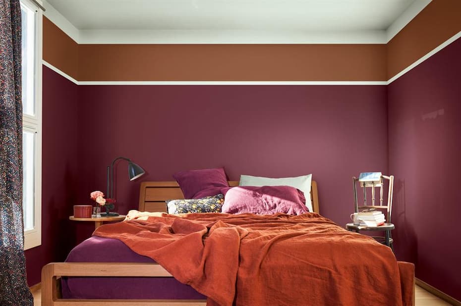
Burgundy with beige

This regal color combination of burgundy and beige is rare but beautiful to see. This color combination is preferred for a big room where it can be neutralized with the help of furniture and decor props that match the room’s vibe. The usage of different shades of brown with beige creates color harmony.

Contrasting colors are never out of trend
If ever in doubt, go for contrasting colors as they complement each other no matter what. One example is here- orange and blue. The combination of warm and cool colors balances the whole room’s vibe and creates a happy space for you to relax and refresh. The orange color evokes excitement, and the blue color provides calmness.
Salmon pink and white
For a happy room, this color combination is a thumbs up. Salmon pink is a warm and happy color also, it doesn’t make the room look dull. Paired with white, both colors give the illusion of a bigger room together. In contrast, the white color makes the room more bright.
Two shades of blue

Blue is a calming color, paired with neutral, making it simple, elegant, and one of the best color combinations. The beige color separating the two different shades of blue is the star of this combo. If you prefer a sober and simple room with decent colors, this is the color combination for you.
Natural tones
Both green and beige are natural colors. Bring nature in, the green and beige together are very lively and calming. If you are close to nature but nature is not very close to you, end this one-sided love of yours by adding natural colors in your bedroom. Adding accent colors and plants will only enhance the aesthetics of the bedroom.
Yellow and blue both stands for happiness

Blue colors stand for calm and peace; on the other hand, yellow color stands for happiness and cheerfulness. Altogether both colors mean good mental health and stability around them.
A touch of accent color in the form of furniture or the ceiling paint white adds extra brightness making the room look good in the natural light.
Sage green and gray

Sage green is a trending shade of green color, using it with gray to have a basic yet elegant look is a clever idea. Gray blends in with every color. It’s one of the perks neutral colors have.
White as an accent color does its job of enhancing the dull colors perfectly.
A lot of purples
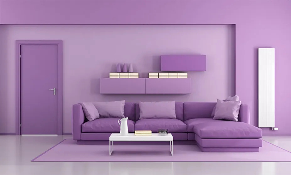
Different shades of purple together do look elegant. If you are still confused, try using this purple color with white color. White color enhances every color’s appearance.
Beige and purple

Purple is a royal color, and it never disappoints when it comes to adding a royal touch to a bedroom. This purple sets well with the natural beige tone and creates a relaxing and calming vibe. This combo shows the signs of sophistication and elegance.
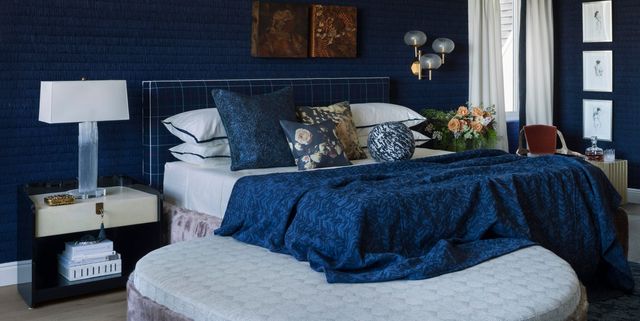
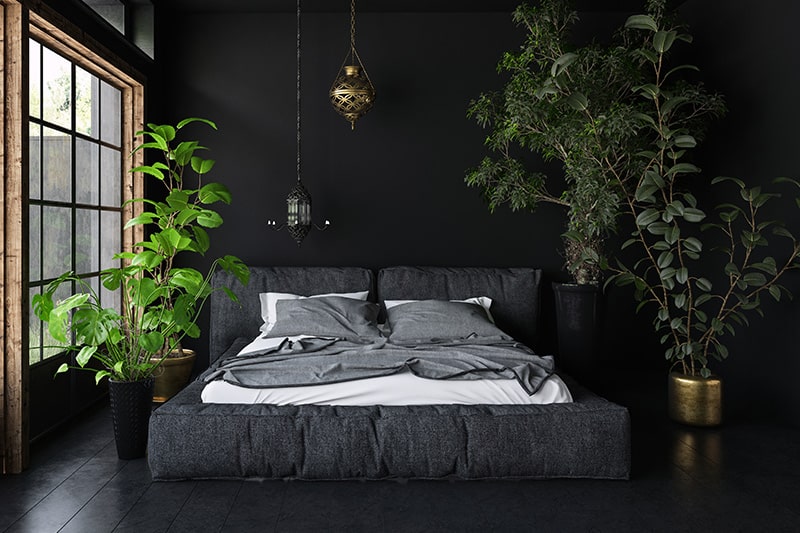
Go dark

If you love dark colors- don’t be afraid to show it. Combine the cooler and warmer tones using your favorite dark colors and add accent colors to complement and sharpen the room’s features.
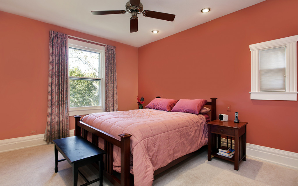
Dark salmon and white

The simplicity and elegance of these colors are able to blow anyone’s mind. Combined with white sharpens the edges and features of this room. On top of that, the simplicity of the furniture elevates the wall’s color to the next level.
Classy Grays

Shades of gray are evergreen you can combine different shades of gray altogether, and they still would complement each other.
Read 15 Best Paint Colors for Gaming Room.
Frequently Asked Questions
How can colors affect the room’s space?
So the simple answer is they don’t affect the room’s space, they only create the illusion of a room being bigger or smaller than the actual size. It happens due to the colors’ tendency to absorb and reflect light. When a color absorbs most of the light and doesn’t let it escape, it keeps the room darker and makes it seem smaller, for example- black. On the other hand, some colors reflect the light and make the room look bright, and it would seem like the room is bigger, for example-white.
Which color is best for the ceiling?
You can choose whatever color you want for the walls, but the ceiling should always be white to balance the colors and to scatter the light making the room look brighter.
In which season should I paint my walls?
It’s ideal to paint indoor walls in the winter to avoid paint peeling. In summer, there is humidity in the air which makes the newly applied paint peel off, whereas, in the winters, the air is dry, which lets the paint dry in peace.


